Do you remember the days of sending off the order forms, hoping to get some orders back from the school? With online galleries there is much better information at your fingertips. We have added these charts to help you understand your customers and to price your products correctly.
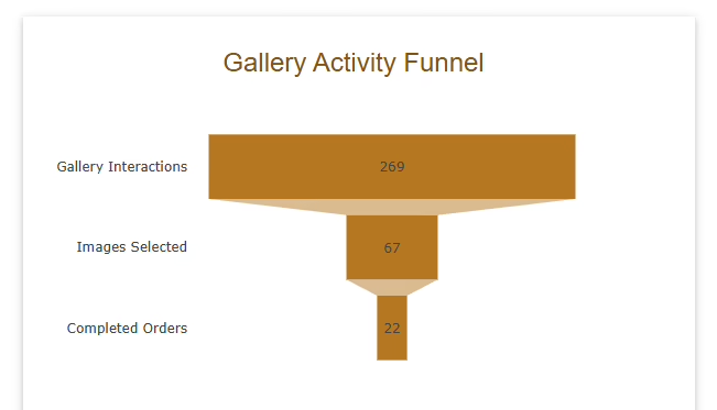
The funnel chart offers excellent insights into how people are interacting with your galleries. The idea is that you want lots of activity at the top resulting in lots of completed orders at the bottom.
Photographers / galleries are all different with different aims so you will need to get used to your specific business model but here are some potential interesting insights you can explore:
Very few Gallery Interactions - This is most likely the result of the gallery not being sent out to the target audience.
A large drop off of Images Selected - Always expect a large drop off here compared to interactions however if the drop off is bigger than what you would expect, consider things like, how difficult was the password to enter, quality of the images, did the correct galleries go to the correct clients etc.
A large drop off of Completed Orders - Your conversion rate from Images Selected to Completed Orders, ideally you would want to aim for atleast a 30% conversion. If you are consistently below that then consider, are you selling the right products at the right price?
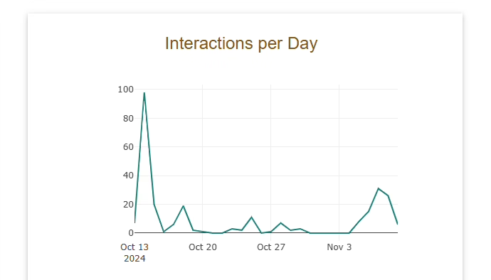
Another chart we have introduced is the 'Interactions per Day'.
This chart is a lot easier to explain. It shows the interactions your gallery received each day. You should expect to see a surge at the start followed by a big drop off in activity. You should also see a bump in activity when the automated emails are sent out before the cutoff dates!
Both charts are available on the shoot details page on Photoset. Remember getting visiblity into how your shoots are performing is a really good way to fine tune your business. Think of the funnel chart as your effort going into the top and your reward at the bottom. Maximise the funnel!